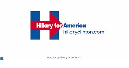
Everyone's Freaking Out About Hillary Clinton's Presidential Campaign Logo

Hillary Clinton officially announced her 2016 presidential campaign Sunday, and it certainly didn't take long for people to begin mocking her admittedly uninspiring campaign logo.
Even for a candidate who was bound to come under an instantaneous wave of criticism and vitriol, Clinton's logo received an ice cold reception. Take a look:
A few tweeters were quick to point out that the logo looks almost like a hospital sign:
Another group of astute users picked up on the subtext of the unsubtle arrow, which is red and pointing to the right, and overlaid on the original blue "H." If it wasn't a deliberate hint that Clinton's campaign strategy will focus on selling her as an easily palatable moderate rather than a firebrand progressive, then she has a big problem:
Others were less than impressed with all the jockeying over who had the funniest Clinton-mocking tweet, or the suggestion the logo was somehow particularly important:
It seems a little disturbing that Americans seem so eager to yell at each other, wildly speculating about political dishonesty and mocking each other over a logo. But hey, that's how you know the campaign has begun. Over the next 16 months or so, we'll find plenty more screwy things to lose our minds over — and we're gonna love every minute of it.