4 Reasons Why Netflix Has the Best Opening Credits on Television

Netflix has revolutionized how we consume our favorite shows. It has provided us with high-quality, original content for nearly three years running. Thankfully, in crafting ambitious series, the streaming service has proven it values one of the longest-standing traditions of television production: the opening credits.
Title sequences in television have long functioned as mini-advertisements for the shows themselves, reminding you of the sitcom's plot (The Brady Bunch: "Here's the story / Of a lovely lady"), the cable drama's mood (The Sopranos: glimpses of a mob boss's commute via the Lincoln Tunnel) and the genre show's ever-changing mythology (Battlestar Galactica: "The Cylons were created by man ..."). A show's iconicity can be boosted by main title design. Where would The Simpsons be without couch gags and infinitely malleable, Springfield-touring titles?
Netflix's original programming understands the branding potential of a strong set of opening credits. Look no further than Orange is the New Black's instantly classic (if immediately polarizing) credit sequence, which features faces of female inmates as Regina Spektor's "You've Got Time" plays near-interminably for a full minute and a half.
Yet it was in the past year that Netflix proved once and for all it has not only some of the best shows on the air, but also the most arresting set of main titles in the business. Here are a few of our favorites to show why.
Grace and Frankie
Designed by: Mr. X
A cake topper featuring two happy couples greets us in the first images of Grace and Frankie's opening credits. We move from tier to tier and see the lives these two couples have led: They get married, welcome children and engage in hobbies. By the end, the grooms indulge in the gay extramarital affair, which leaves our female leads tethered to one another even as the cake that sits below them — much like their lives as they know them — crumbles to pieces.
The seriousness and symbolic power of the wedding cake, currently still a point of contention in many an anti-gay bakery squabble, is countered by the glossy, cartoony look of the toppers. (Those flamboyant golfing sweaters should really have given Grace and Frankie pause.) It makes the final disintegration of the cake feel melodramatic, but ultimately sweetly charming, not unlike the seriocomic show itself.
Marco Polo
Designed by: The Mill
These gorgeous titles are striking in their simplicity. Mimicking the Xieyi style of Chinese painting (a style described as "drawing the spirit of beings"), black ink floods the screen forming images evocative of the swashbuckling Marco Polo at the center of Netflix's ambitious international production. Perhaps as an antidote to the gory scenes that litter the series, these credits suggest the specter of violence with clean lines and a muted palette.
Impaled bodies, severed heads and fighting wolves are inked in while an erhu (a two-stringed Chinese instrument) trills in the background. It's calligraphy via Rorschach, boldly announcing that this is not your father's dusty Marco Polo. These may be the most visually stunning of all Netflix's titles, especially once you learn they were mostly created using real ink.
Marvel's Daredevil
Designed by: Elastic
Marvel's opening credits have been dazzling moviegoers for years. Think of the World War II poster art-inspired titles of Captain America: The First Avenger, or the campy freeze-frame '70s look of Iron Man 3's end titles, and you've got helpful sequences that establish tone, origin stories and present a perfect blend of pop art pizzaz and winking visual flair that's become a staple of the studio's output.
For its first foray into streaming television, Marvel enlisted the team at Elastic, responsible for the Emmy-winning credits to HBO's first season of True Detective, to create a moody intro to the "Man Without Fear." The minimalist result is a red, blood-soaked vision of Hell's Kitchen. The monochromatic approach underscores Matt Murdock's own blindness while reminding us that both his alter ego and his New York City neighborhood are born out of and forever tainted by spilt blood.
Unbreakable Kimmy Schmidt
Designed by: Pentagram
Selling a comedy about a woman's decision to start her life anew after living in a bunker for 15 years is no easy feat. One element that helped cement Tina Fey's latest sitcom as a must-watch event were its opening credits. In the show's pilot, the news footage that tells us of Kimmy's plight leads seamlessly into a brightly colored 'auto-tune the news' montage. Employing a Gregory Brothers' songified tune, the segment turns a traumatic experience into a laugh-out-loud viral sensation.
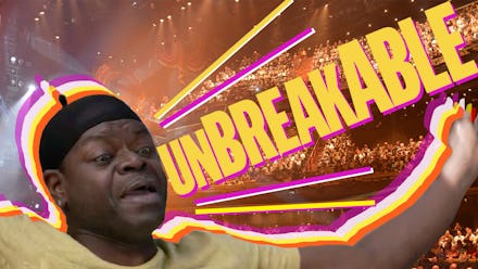
In the sequence's highlight moment, as a Bed Intruder-inspired character sings out the word "Unbreakable!" we see a young girl fall face first into the pavement. Star Jane Krakowski's name flashes above it in bright pastel colors. The jittery America's Funniest Home Videos feel of the clip, which catches us laughing at an obviously inappropriate and painful situation, perfectly encapsulates Fey's series, which finds humor in the darkest of situations.
In the past year, Netflix proved once and for all it has not only some of the best shows on the air, but also the most arresting set of main titles on TV.
This is just the tip of the iceberg. To this list we could add BoJack Horseman's ennui-filled animated credits and the mouth-watering place-setting sequence that opens the documentary series Chef's Table. On their own, each of these titles would merit being singled out for their successful embodiment of the very shows they represent. Take note, Emmy voters.
Together, they speak to Netflix's loud and confident arrival as a truly groundbreaking television network, committed to perfecting even the smallest details in its original content.