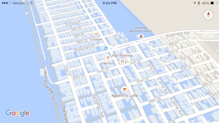
Google Maps Now Shows You if Climate Change Will Put Your Home Underwater

On our hottest and coldest days, we joke and whine about climate change and the terrible weather. But in 2015, we're lucky that we don't have to see the true effects of what might be ahead of us after global temperatures rise. That's why this version of Google Maps is an eye-opener.
On Friday afternoon, Google Maps started showing what coastal L.A. would look like after a few feet of rising sea levels. The changes show up in neighborhoods like Malibu and Santa Monica.
This information comes on the same day as a worst-case scenario report showing that burning all of the Earth's fossil fuels could raise our sea level hundreds of feet, making the scenarios pictured on Google seem quaint in relative devastation.
You can view the results online and in the Google Maps mobile app.
Google hasn't made any announcements about whether or not this was intentional or whether there will be more cities added to the mix. Because it's not just L.A. that would be affected by rising global temperatures. It's all of us.
Google didn't include many major cities like New York, but there's a map for that too. The Surging Seas map, created by Climate Central, allows you to pull a slider and put various U.S. cities underwater, foot by foot. The map above shows what happens to New York City when the sea rises 10 feet: Water would destroy dozens of neighborhoods and displace millions of residents.
To achieve the reality above, global temperatures would have to increase only 2 degrees Celsius, a conservative estimate of what will occur if we can't slow our carbon emissions significantly or cut them off completely by 2050.
Low-elevation cities aren't the only ones who will hurt from climate change. Certain countries are much more (or much less) wasteful with carbon emissions, with a reckless industrial system and few regulations. Not every human being is at risk equally; people living in poverty or closer to sea level are more likely to be displaced or have reduced access to medical services.
The interactive Carbon Map, made by data journalism group Kiln, is adjustable by "responsibility" and "vulnerability," so you can check each of these factors individually. The map makes it much plainer why it's easy for Americans to ignore the effects of climate change when you see what's in store for Africa and Asia.
Update: Google has confirmed that the Maps display of L.A. underwater wasn't intentional, but the result of a glitch. The rest of the story remains factual.