The Most Common Last Names in Every State — Mapped

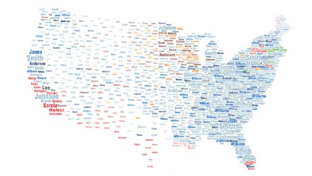
Do you ever try to Google someone only to find out that thousands of people have the same last name? Or at least it seems that way. Well, National Geographic has put together a map to show just how common your last name really is. The map shows the most common last names in each U.S. state, sized according to the number of people with that name.
Click here to visit interactive map.
Pretty cool, right? The different colors indicate the name's country of origin — blue is Britain, red is Spain, brown is Scandinavia, yellow is German, green is Irish — giving a colorful and telling picture of how different ancestries have established themselves in different parts of the country.
There are a couple issues with the map, though. The data is somewhat out-of-date, having been compiled by researchers at University College London from phone directories in 2000. Furthermore, because slaves historically took their owners' names, African-Americans are mostly invisible on this map. Along the same lines, Jewish immigrants have been known to anglicize their name upon arriving to the country, leading to under-representation on a map like this.
Having said that, it's still pretty cool look at what kinds of people make up America. Spoiler alert: it's mostly people named Smith.