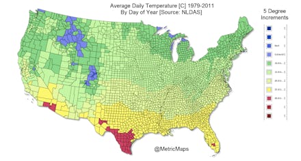
Watch the Seasons Change Across America in One Mesmerizing GIF

The above GIF, created by MetricMaps, shows the average high daily temperature for each day of the year over the period 1979-2011. The data was pulled from the Centers for Disease Control and Prevention's North America Land Data Assimilation System Daily Air Temperatures and Heat Index, which contains ambient ground temperature data down to the county level.
You can start to see the heat creep in from the Texas-Mexico border as early as the end of March, when the first sliver of red appears at Zapata, Star and Hidalgo counties at the southwestern-most tip of the state. Summer creeps up from Texas, the southern California/Arizona area and the Florida panhandle. Months later, winter sweeps in in along the northernmost border of the Midwest and down from Maine, hardly reaching the southern tips of Texas and Florida at all.
The fascinating visualization doesn't necessarily tell us anything new or insightful about the ebb and flow of seasons in America (unless you don't know what seasons are), but one redditor used the same dataset to map out the average climb in peak temperatures over that same time period in the Northeast, resulting in a "remarkably significant" upward trend:
If this looks familiar, it should. The Intergovernmental Panel on Climate Change reports that average ground temperatures across the planet increased by about 1.53°F (0.85ºC) from 1880 to 2012. According to the Scientific American, global temperatures are now higher than they have been for 75% of the last 11,000 years and are on track to reach heights unseen since the end of the last ice age. Here's how NASA projected the expected rise in global temperatures:
Our temperature change map may soon have a little more red splashed over it for more of the year. At least Maine and Washington state look nice.