Want to Change Someone's Mind? Just Show Them a Random Chart

Charts are great storytelling tools. They're incredibly useful for visualizing or summarizing often complicated topics, from macroeconomic data to social and political trends. As a result, they're a favorite tool for journalists who want to convey important (but often boring) information in an attention-grabbing way.
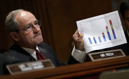
The researchers found that when a claim about a new drug's effectiveness was presented in text form, 67% of research participants said they believed it. But when the text was accompanied by a simple graph making exactly the same claim, 97% of participants believed it.
Why it matters: The researchers see a troubling problem brewing for both scientists and journalists tasked with articulating complex topics to the public. "If a claim 'looks and smells' scientific, a person may be inclined to believe," write Wansink and Tal. "In other words, communications may be made more convincing without any alteration in content, simply by virtue of being presented with elements associated with science."
Yes, charts and graphs are great, especially when deployed effectively by scientists and journalists, but they also have the potential to obfuscate and misinform. Here's a pro-tip: Always look at the data — and use those critical thinking skills first.