Rose Quartz and Serenity Win 2016 Pantone Color of the Year to Prove a Point About Gender

There is power in color — even the softest, most delicate hues.
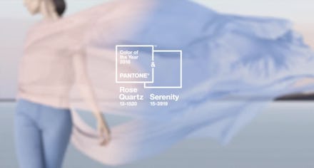
Pantone has announced its Color of the Year for 2016, an inexplicable yet time-honored tradition from the color authority that is watched by all the in fashion world and beyond. This year, the winning color is actually a two-way tie, between Serenity, a purplish baby blue, and Rose Quartz, an icy pale pink.
A progressive statement about gender: The pairing are both in the pastel family, which should give '90s kids everywhere flashbacks to their childhood bedrooms or recital costumes. But Pantone, the "world-renowned authority on color and provider of color systems," insists that the colors not only have visual depth, but also a deeper meaning when paired together.
"In many parts of the world we are experiencing a gender blur as it relates to fashion, which has in turn impacted color trends throughout all other areas of design," describes Pantone on the company's website:
This more unilateral approach to color is coinciding with societal movements toward gender equality and fluidity, the consumer's increased comfort with using color as a form of expression, a generation that has less concern about being typecast or judged and an open exchange of digital information that has opened our eyes to different approaches to color usage.
That baby blue and baby pink you see when you glance at "Serenity" and "Rose Quartz"? It's on purpose — those are the stereotypical gendered colors of our childhoods coming together in perfect, gender-neutral harmony.
Pantone hasn't typically used its Color of the Year to make a bold statement. Last year's Marsala, a reddish-brown, was cited for its richness and earthiness, and 2014's Radiant Orchid, a pinky purple, was "expressive" and "beguiling." The point of naming a "color of the year" (besides, y'know, publicity) is to set a color to tip off and inspire the fashion and design worlds on a coming color trend.
What is Pantone, again? As a company, Pantone's mission when it was by revamped by Lawrence Herbert in 1963 was to standardize colors into a categorized system to help designers speak the same color language. "Through this system, graphic designers, fashion designers, interior decorators, and architects can now specify this deep dark blue—and not that navy blue—and know they're talking about the same thing," reported Quartz.
Now we've got two more colors to add to the lexicon — although to be fair, one of them already sounds eerily like another color crowding our visions. Rose Quartz... does it not sound like a close cousin (nay, a rip-off) of the much-beloved rose gold?
We bet it'll only take about 1.5 days for "rose quartz hair" to hit a hairstylist's Instagram and take over your feed. Blend it with "serenity hair," and you have a dreamy, Trix Yogurt 'do that shatters gender norms in the process. How 2016.