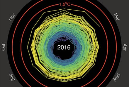
This "Doom Spiral" Is All You Need to Understand Global Warming

Global temperatures are spiraling out of control, and this spiral animation proves it.
Climate scientist Ed Hawkins created the design using global temperature data from January 1850 to March 2016.
It's clear in the animation how quickly temperatures rose across the last few decades. You can see that we're getting dangerously close to average global temperatures rising 2 degrees Celsius from mid-19th-century averages.
Scientists and policy makers are racing to stop this. An increase greater than 2 degrees could push us over the edge of a dangerous threshold where some consequences of climate change would become irreversible.
Things aren't looking good. 2015 was officially the hottest year on record, and it's looking like 2016 will be even hotter.
It gets even worse. Global temperature isn't the only spiral of doom out there. It's possible to represent disappearing sea ice with a similar shape:
The Paris climate talks at the end of 2015 were a good first step in preventing temperatures from rising too much, but many scientists warn that it's nowhere near enough.
We'll need more serious policies in place to stop this spiral.