This Map Reveals Where All Your Trash Is Going — And What It's Doing to the Planet

Most of us probably don't spend a lot of time thinking about where our morning coffee cup went, or where our plastic salad bowl will end up when we throw it out after lunch.
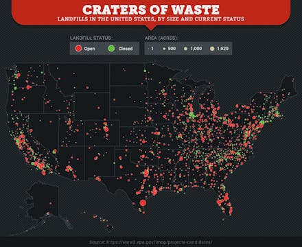
The company SaveOnEnergy compiled data from the Environmental Protection Agency and created a map that illustrates the massive number of landfills across the U.S. Red dots represent open landfills; green dots represent closed ones. The bigger the dot, the bigger the landfill.
You can see how the number of landfills has skyrocketed since 1990 in the GIF below:
You can see the past 100 years of landfills on SaveOnEnergy's website.
The mind-blowing quantity of landfills makes sense if you add up how much trash the average American produces each year. According to EPA data, the average American produces about 4.4 pounds of trash every day, but that quickly adds up, SaveOnEnergy writes:
Your 4.4 pounds of daily trash is approximately the weight of a modest-sized pumpkin that you would carve on Halloween. Add up all those "pumpkins" over the seasons and they come in at 1,606 pounds — or the size of your average cow. But if you pack that trash into cubed feet, you're looking at the height of the Leaning Tower of Pisa.
And it's even worse if you consider the average amount of trash an American family produces, or the average amount the U.S. produces in a year:
After all that trash gets piled into landfills, it starts to break down and releases a gas that's about half methane and half carbon dioxide mixed with water vapor. Methane and carbon dioxide are both greenhouse gases that contribute to global warming.
While we may not be in danger of running out of landfill space anytime soon, allowing our trash to balloon out of control is probably not a good idea for the environment or public health. Some ways to reduce trash include recycling and composting leftover food.
Read more: