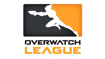
‘Overwatch’ League Logo: MLB considers blocking Blizzard’s trademark over logo design

Blizzard Entertainment said it modeled its competitive Overwatch League after actual professional sports leagues, but Major League Baseball seems to think those similarities might be a little too striking. At least, as far as its respective logos are concerned.
According to a blog post on the Morrison/Lee law firm’s website, the MLB just made a move that indicates it might be interested in filing a trademark dispute over the Overwatch League’s logo.
Overwatch League logo: Does the MLB have a case?
Here’s how it all works: Once a trademark is approved by the United States Patent and Trademark Office, other companies have 30 days to respond to it. On the final day of that window for the Overwatch League’s logo, the MLB filed for a 90-day extension for additional time to consider whether or not it’ll oppose the logo. The United States Patent and Trademark Office’s Trademark Trial and Appeal Board granted that extension. So now the MLB has until July 26 to make a decision.
It’s not hard to imagine why the Overwatch League logo gave the MLB pause. The visual similarities between the two logos are pretty undeniable. Both feature the white silhouette of a figure facing left over a two-tone background — but it’s not that simple.
In order to strengthen its case, the MLB would likely have to demonstrate that the Overwatch League logo would confuse consumers and make them think the two leagues were connected, according to Mashable. Since the NBA logo also falls into the exact same design style, that argument might be a little tougher to prove.
More Overwatch news and updates
For more on Overwatch, check out the rest of what Mic has to offer. Here is an intro to the cute, new “Wholesome Overwatch” subreddit, a look at some gorgeous Overwatch-themed PS4 and Xbox One controllers, a cool Easter egg in the new Horizon Lunar Colony map and a criticism of Blizzard’s failures in its design of Symmetra.