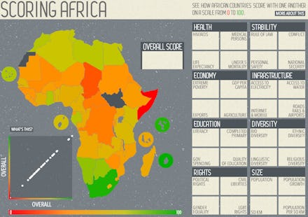
This Awesome Interactive Map Will Make You Think Twice About Africa

Source: GreatBusinessSchools.org
They say a picture is worth a thousand words. Well, a trend line can theoretically share an unlimited number.
That's what I love about this graphic of Africa: not just that the vast range of data makes each individual plot fade to obscurity, but that there's so much better perspective. There are peaceful countries in Africa, and prosperous ones (like everywhere) — and there are absolutely horrible conditions. But Westerners never see the two side by side, and arbitrarily impose upon Africa an arbitrary, conformative perception of universal death and poverty. The Western media has its "Africa rising" stories and ist genocide stories, and for each it's like the audience is cued by mid-sentence to say "We've heard all this before."
But viewing things side by side, the significance of each variable becomes readily apparently. There aren't any easy cures, but there are some obvious causes of pain.
Another takeaway: Africa is massive. If arranged properly, Africa could hold the U.S., China, Western Europe, India and Argentina. It's home to 54 countries, and has more diversity than any other continent. Yet it's likely you never hear anything about it. When's the last time you saw a news story about Burundi or Benin?