This Bogus Graph is What Fox News Wants You to Believe About Poor People

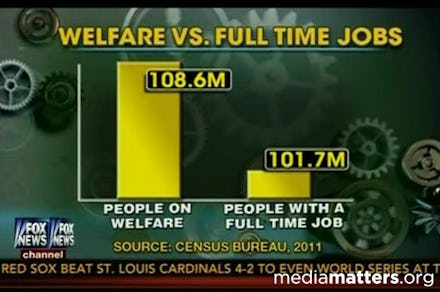
Fox News has a history of misleading viewers with distorted infographics. Most recently, they attempted to compare the number of people receiving federal benefits with the number of people who work full-time in order to support the idea that most people receiving federal benefits don't deserve them. However, as Hannah Groch-Begley at MediaMatters observes, their comparison is dishonest.
In the chart, Fox News truncates the y-axis in order to exacerbate what is actually a small difference between the numbers of people receiving federal benefits and those working full-time. Fox would have you believe that five times more people receive federal benefits than work when actually, according to their numbers, only about 1.06 times as many people receive federal benefits.
Of course, how they represent their information doesn't really matter because their numbers are bogus. Their number of people receiving welfare (table two) includes all people who live in a household where at least one member receives federal benefits. Their number of full-time workers counts individuals, rather than people living in a household with at least one full-time worker. Furthermore, plenty of people who receive federal benefits also work full time. To try to draw a stark division between the two is to ignore the realities of poor and working class people.
Ultimately, Fox News relies on the conservative belief that 47% of people take advantage of the resources provided by the government without paying their fair share. This is not the case. This is just more conservative drivel meant to incite class warfare at the expense of our nation's most vulnerable citizens.