This Chart Debunks Everything Republicans Want You to Believe About Obamacare

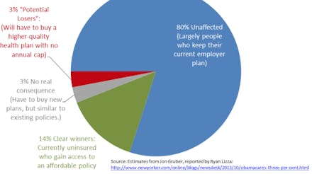
The American public is having a very difficult time understanding the actual effects of Obamacare. Fortunately, Justin Wolfers, a University of Michigan professor and senior Brookings fellow, has seen our struggles and created a simple pie chart to break it down for us. The chart is based off of the findings M.I.T. economist Jon Gruber.
In bright bold colors, the chart shows that the vast majority of Americans (80%) will be entirely unaffected by the Affordable Care Act. Another 14% percent will gain access to affordable insurance that previously didn't exist. The last 6% of citizens is broken into two groups that are required to buy new insurance plans. Of these, 3% will need better plans with no annual coverage cap and 3% will need new plans with similar policies to their existing plans.
Despite the fear-mongering rhetoric of the conservative right, actual analysis shows 97% of Americans will benefit from the new law. The three percent who are the "possible losers" are required to buy better health insurance plans that meet basic coverage requirements. It is hard to feel bad for the small percentage of people who will now have plans without annual limits on coverage.
Bottom line: the massive media campaign designed to depict Obamacare as the apocalypse drastically over exaggerates the "negative" effects of the law.
Check out PolicyMic's Jake Horowitz and Liz Plank's segment on this for Huffpost Live: