Africa is So Much Bigger Than You Know

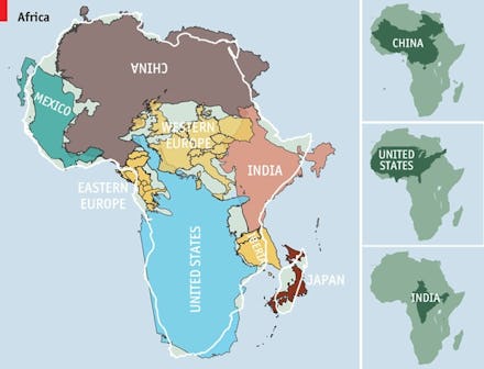
In making what he calls "a small contribution in the fight against rampant Immappancy," computer guru Kai Krause caused an uproar recently with his spin on the traditional world map. "The True Size of Africa," as Krause's map is titled, shows an outline of countries jammed into Africa. The Economist did a recent spin on Krause's map, and the results will shock you.
Does Africa seem surprisingly large? If you're a student, then you've probably had some entry level geography. You know that Africa is an enormous land mass home to many diverse nations and biomes, but you probably never realized that all of the U.S., Japan, Eastern Europe, China, and India could fit into the continent. That's because every world map you've looked at until The Economist's version has been wrong in its representation of the true size of land masses. While the countries are flipped around to fit into Africa, at least the Economist gives the continent a fair shake in terms of its actual size.
Immappancy, as Krause calls it, refers to the century-long misrepresentation of countries as they are traditionally arrayed on a world map. Because a sphere cannot be accurately displayed on a plane without some sort of distortion as it gets stretched out, there will naturally be some mistakes as one transfers its area (the spherical earth) to a flat surface (a map).
By looking at a traditional Mercator Projection, also known as a traditional map, you will never really be looking at the world as it truly is. With this type of projection, the land masses get twisted, some are distorted, and the real distance between two points gets screwy. While the shapes of countries can be preserved, their size relative to others is never perfect.
I won't go into the longstanding theories of why Africa, rather than other continents, appears so small, but if you want some background check out the West Wing clip below.