America's Job Crisis, Explained in One Simple Chart

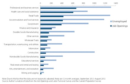
The Economic Policy Institute (EPI) released some alarming data recently. A new chart titled "Unemployed and job openings, by industry" shows the relationship between those who are unemployed and actively looking for a job and the number of jobs available in the industry that person is searching in.
The numbers, as you might expect, are not pretty. The headline reads "Number of unemployed far outstrip number of available jobs across the board," and that really is the best way to sum up the lackluster performance of U.S. job growth right now.
As you can see above, in most industries surveyed the number of available jobs is less than half of the number of unemployed seeking a job in that sector. In some industries, there are three, four, and even five times as many job seekers as there are available jobs. Translation: Our economy and the American people desperately need more jobs.
Unemployment has been falling to its current level of 7.2%. But certain demographic groups remain severely unemployed or underemployed, including African Americans (12.9%) and Hispanics (9%). The current number of long-term unemployed, meaning those who have been jobless for 27 weeks or more, stands at 4.1 million.
The non-profit, non-partisan EPI, created to broaden the discussion on economic policy, is certain to start a conversation from this data. If the American economy is going to be the engine of job creation and middle class empowerment that it once was, our political leaders need to put aside the partisan differences that jam up government and hamstring the unemployed, and search for bipartisan solutions that cut into this EPI data.
This is what think tanks are for; EPI did its job by providing important data to the public. Now lawmakers should do their jobs, and refocus legislative efforts on job creation.