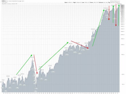
This Graph Predicts a Scary Path the U.S. May Be Heading Down

The news: On Friday, the Dow Jones industrial average, the index that tracks 30 U.S.-owned public companies and is seen as a barometer of stock market health, crossed the 16,000 mark for the first time. Another index, Standard & Poor’s 500, also made history, closing over 1,800. News agencies crowed at the financial feat, and described it as a marker of a strengthening American economy.
The background: The Dow’s sharp rise — it hit a low of 6,547 after the 2008 collapse, or less than half of what it is today — has been attributed to unexpectedly encouraging jobs reports and to the Federal Reserve’s “easy-money” policies, which have been maintaining low interest rates. However, before we break out the champagne and dive head first into a pit filled with gold coins, Scrooge McDuck-style, it’s worth taking a moment to consider that rampant Dow growth isn’t always a good, or sustainable, thing.
The reality: As you can see in this historical chart, which shows the Dow’s jagged journey upward since the beginning of the 20th century, sharp historical rises in the Dow are often accompanied by equally sharp market corrections. The sharp growth and steep decline in advance of the 1929 crash are readily evident, as are the more recent fluctuations caused by the dot com and housing bubbles over the past 15 years.
Source: Infomedtrades
The Dow’s current climb (it’s grown 25% so far this year) is the result of what many consider to be an unsustainable amount of quantitative easing by the Fed, which is currently buying a whopping $85 billion in bonds every month in order to suppress the inflation rate and keep banks flush with cash. While easing has helped indexes like the Dow rise sharply, it hasn’t had as much of an impact on everyday Americans, who are less invested in the market than they were before the 2008 crash, struggling to buy homes in the recovering housing market, and facing an unemployment rate that, though improved, is at 165% of what it was in 2007. (Young people remain among the hardest hit; 15% of Americans between the ages of 16 and 24 are neither employed nor attending school.) The Fed’s contribution is also likely to dwindle in the near future, as Fed Chairman Ben Bernacke has stated that he hopes to reduce the quantitative easing program shortly and end it entirely next year.
Source: Advisor Perspectives
More worryingly, the Q ratio (shown above), a measure of overvaluation in stocks and a predictor of stock market crashes, has been on the rise. A higher Q ratio indicates that stocks are selling for far more than they're worth, meaning that the Dow’s sharp growth may not represent recovery, but an economic bubble that’s waiting to burst. The Q ratio is currently climbing to levels unseen since the turn-of-the century dot com crisis.
Given the risks inherent to sharp market growth, it’s worth taking reports of a record-high Dow with a grain of salt, and remembering that, for most Americans, round-number Dow milestones are more of a numbers game than they are an indicator of real change.