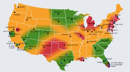
The Status Of the American Economy — In One Simple Heatmap

The news: This November employment map from Deutsche Asset & Wealth Management makes concrete just which regions of America have been favored by jobs growth, and which have been left behind.
Source: Deutsche Asset & Wealth Management
The map shows areas of strong employment growth in green, average growth in yellow, and slow growth in red. It also denotes areas likely to be hit by automatic defense cuts thanks to a federal budget impasse.
The background: It’s no secret that that America’s economic recovery has been lopsided. While 200,000 jobs were created in last month, allaying fears about the impact of October’s government shutdown, those new opportunities weren’t evenly distributed across economic sectors or age groups, let alone around the country.
At first glance, the nation’s success stories may not seem to have much in common: economic growth is favoring Google Glass-wearing brogrammers in San Francisco and migrant miners fracking in North Dakota, alike. However, on closer inspection, prosperous areas share some commonalities. Regions that depend on fossil fuel extraction, like the Dakotas and Texas’s Gulf Coast, are thriving, as are places like California, Utah, and the Southeast, which have attracted tech companies and cultivated research and development.
Meanwhile, Detroit, Reno, and southern Florida have yet to recover from their outsize role in the mortgage crisis. While housing prices and mortgage rates are down, home sales remain sluggish, leaving those locales with a slew of vacant buildings. And while the Northeast has fared better overall since the 2008 crash, its financial sector is expected to slow in 2014 as the Federal Reserve ends quantitative easing.
The takeaway: The map shows the limitations of nationwide employment statistics as an economic indicator, especially for people searching for a job locally. Frustrated un- and underemployed Americans in St. Louis and New Orleans are likely pondering about where October’s hundreds of thousands of jobs went, while job searchers in Orange County and Atlanta wonder what all the fuss is about. Like other maps before it, Deutsche Asset & Wealth Management’s chart shows that the United States’ is composed of many different Americas — and points to why, when it comes to budgeting, it’s so hard for us to get along.