Here’s the Cool Graph Reddit Fans Should Show Haters Who Still Claim It’s Not a Legit News Site

Known as the "front page of the Internet," Reddit is one of the most interesting websites around. As everything from a news aggregator to collection of discussion forums to a launch pad for anything viral, it's a vast website that does its best to condense everything around the Internet into one fairly digestible place. But it hasn't always been so easy to use or so popular.
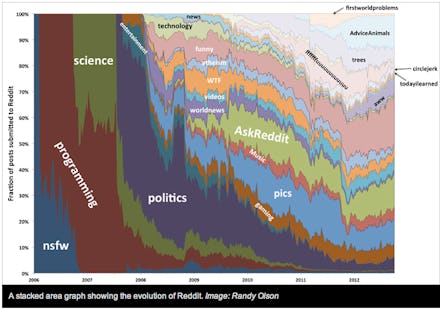
A new graph created by Michigan State University PhD student Randy Olson shows how Reddit and its network of subreddits have evolved over the past few years.
In his research, Olsen tracked the evolution of the site since its inception in 2005 and saw that while the primary user base has been "horny programmers" for much of the time, the development of topic-specific "subreddits" have made Reddit and much more inclusive community with a vast array of users talking about many different topics. Although Olsen developed several interesting graphs to track this (as well as this very cool interactive map), the most reveling one shows how the site's 24 most popular subreddits have developed over the past few years.
As you can see from the graph, 2008 was the year when Reddit really started to take off by allowing users to create their own subreddits, making it even more possible for users to make the community their own. This quickly prompted the creation of subreddits such as r/pics, r/WTF and r/funny, as well as a variety of subreddits dedicated to pictures and videos (which has always been Reddit's bread and butter).
Despite the bad jokes, Reddit always has been somewhat of a haven for horny programmers (subreddits like r/gaming and r/gonewild (NSFW) have always been among the most popular), but as Olsen's graph demonstrates, it has become an increasingly diverse and open place for just about anything.