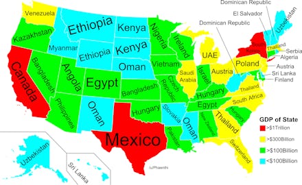
This Eye-Opening Map Shows Just How Rich Every U.S. State Really Is

You knew the U.S. was rich, but did you know just how rich?
Redditor Phaenthi posted this map showing us the countries that each state's GDP overtakes. The result is compelling, and oddly troubling when you mull the results.
For example, this map is not adjusted for population size. That means that "Minnesota has a population of ~5.5 million and Nigeria has a population of ~175 million," or in other words, that the statistically average Minnesotan has at least the same wealth as around 32 statistically average Nigerians.
Texas' 2012 GDP of $1.4 trillion is considerably bigger than Mexico's $1.18 trillion. But Texas had an estimated 25,145,561 people in 2012 to Mexico's roughly 116,900,000. New York's 2012 GDP was $1.2 trillion (turns out hosting the world's center of finance has its benefits), beating out the entire nation of South Korea's $1.12 trillion.
Some other surprises: The tiny state of Maine is more wealthy than Uzbekistan, while California beats out the entire nation of Canada. California's $2 trillion in in 2012 far exceeded our neighbor to the north's 2012 total of roughly $1.82 trillion. Illinois ranks very highly, beating out oil-rich Saudi Arabia, but that's because Chicago happens to be one of the richest cities on earth.
Looking farther South and Southwest, though, the comparisons are a little less impressive. Utah beats Angola, while Mississippi beats Oman and Louisiana overtakes Pakistan. And Florida's GDP per capita is $40,231, while Switzerland's GDP per capita is $78,925 (seventh in the world), meaning that it's actually not a very impressive showing.
What you can take from this map is that the U.S. remains very, very wealthy, and its productive capacity outranks much of the world put together. But at the same time, this map doesn't track more useful statistics like Purchasing Power Parity (PPP) — a measure that is essentially an adjusted cost of living measurement. Alternatively, median household income would be a more telling measure. While this map shows us just how much wealth each state is capable of generating relative to the rest of the world, it doesn't tell us very much about how the people in those states are faring.