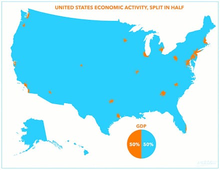
The Tiny Orange Dots on This Map Account for 50% of U.S. GDP — A Unique Perspective

How much economic power do the biggest urban centers in America wield? A hell of a whole lot, actually.
Reddit user Atrubetskoy created this mind-bending map of the biggest contributors to America's $17.1 trillion gross domestic product (GDP) — the market value of all the goods and services produced in the country annually. The map shows around 17 individual economic hotspots burning bright orange, contributing a whopping 50% of U.S. GDP. The rest of the whole of the United States, in blue, makes up for the other half.
And broken up into quarters:
But is it accurate? Atrubetskoy clearly has taken artistic liberties, focusing on the most concentrated areas. Still, the map is relatively in line with other data and research. Some analysts have pointed to 11 "megaregions" throughout the U.S. as the biggest economic drivers in the country. These megaregions are swaths of connected regions, centralized among core cities. Their own visualization proves that American economic potential is highly concentrated.
The agglomerations largely compliments this data — the top U.S. metropolitan areas by GDP output:
Image via Wikipedia
Then things get a bit more interesting: Atrubetskoy overlays the map above with an election 2012 map, creating this nugget:
On a macro election scale, these are the political heavyweight centers. A note to politicians: follow the money ... these are where your most wealthy supporters live.