Where Children Go Hungry in the World — In One Alarming Map

We often hear about global inequality, but it takes a map like this to really see it with our own eyes.
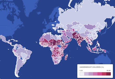
The map below, created by journalist Tim De Chant, illustrates where in the world children go hungry, and highlights the areas where children are dangerously underweight:
The areas in red, which indicate severe weight and malnutrition issues, stretch from Western Africa to South Asia. The highlighted region is also home to a host of related problems, from high infant mortality rate to high incidences of death from preventable diseases. (The blue areas did not have available data from 1990 to 2002).
According to the UN, "Underweight is most common in the UN regions of Southern Asia (30%), followed by Western, Eastern, and Middle Africa (20%, 19% and 16%, respectively) and South-Eastern Asia (16%). Oceania in 2012 was estimated at 19% underweight with high uncertainty due to scarce data." Eastern, Central and Western Asia and North Africa have significantly lower rates than the rest of their respective regions.
In comparison, less than 10% of children in Europe and the Americas are underweight. While the U.S. and Canada are not represented on the map, the number of children who are underweight is negligible in both countries (around one percent, according to the World Health Organization).
While every country in the world invariably has children who go hungry, the shocking disparity illustrates what we must acknowledge about child hunger: it's a global inequality issue, and those in developed countries must step up to end it.