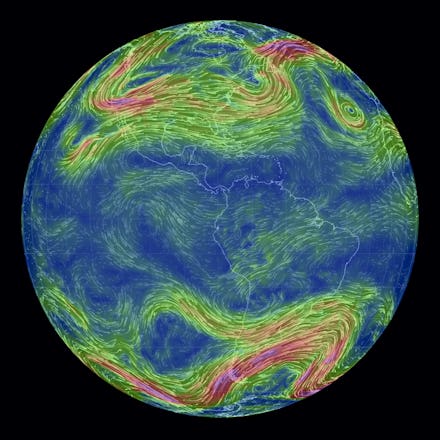
This Interactive Map of Earth's Weather Is the Most Stunning Thing on the Internet

The current season has been harsh for many: Freezing temperatures and heavy snowfall in the U.S., wild storms and flooding in Europe and blazing heat and bushfires in Australia. It can be hard to appreciate the wonderful intricacies of Earth's weather systems while they're causing you to suffer. But this stunning visualization may change your perspective. Created by programmer Cameron Beccario, the data comes in every three hours from the supercomputers of the Global Forecast System, the same number crunchers that provide our news weather forecasts each night.
The most stunning aspect of the interactive is its detail. You can change the altitude to look at winds in different layers of the atmosphere. Clicking on the "Earth" button will present a feast of options for showing different map projections or data overlays. In addition to wind, you can look at ocean currents, temperature, humidity, air density and more. You can also change the time to examine extreme past weather events like Superstorm Sandy, or go forward to look at future forecasts.
What are you waiting for? Have a go at the interactive above, or click here for a full screen rendering. Here are some insightful highlights:
1. The winds around Typhoon Haiyan.
Typhoon Haiyan hit the Philippines in early November 2013, and was the strongest storm ever observed at landfall, with wind speeds close to 200 miles per hour during its peak. It was also the deadliest typhoon in the country's history, killing over 6,000.
2. This is what the polar vortex looks like.
The polar vortex is a large low-pressure system that is present at the Earth's poles. It is normally held in place by the jet stream, a fast-flowing air current that divides cold air from warm air. This winter, the jet stream was disturbed by a powerful high-pressure system in the Pacific, allowing the polar vortex to spill southward and create freezing temperatures and heavy snowfall in the U.S.
This map shows how far the polar vortex has dipped. To compare with its "normal" location, click "Earth" and using the arrows to navigate dates.
3. This is how winds in the stratosphere appear looking down at the North Pole from space.
The Earth's stratosphere sits six miles high in the atmosphere, influencing events in the lower troposphere layer, which is responsible for the weather we see. The stratosphere also influences ocean currents. This is important because human activity, such as burning fossil fuels to release carbon dioxide, can lead to changes in the stratosphere and therefore global climate, which is moderated by ocean circulation.
4. Ocean surface currents show incredible complexity when zoomed in close.
Shown here is the equatorial current system in the Pacific. The data comes from the OSCAR project, a direct computation of global surface currents using satellites to detect sea surface height, wind and temperature.
5. This special view compares temperature at the poles.
This map is an Atlantis projection, which places the Atlantic Ocean at the center and allows both poles to easily be seen and compared.
6. How winds affected trade routes throughout history.
Sugar, cotton and tobacco were huge export items in the 18th century. This trade system involved slaves being brought over from Africa to the Americas to grow the product, which was then shipped to Europe. One of the main reasons why this system worked was because of the triangular direction of the trade winds, which allowed efficient transportation between the ports. The world’s first consumer boycott targeted sugar, and was organized in Britain in 1792 to oppose this slave trade.
Click here to read more about how winds affected trade.
7. Surface winds traveling around islands in the Pacific look just like water speeding past rocks in a stream.
Some of these visualizations do well in highlighting the similarities in physical phenomena from different scales.
8. This wind power density map shows why the U.K. is the largest producer of offshore wind energy.
The United Kingdom is the world's leading generator of offshore wind power, followed by Denmark. Both countries are well situated for this, as you can see from the map. The world's largest offshore windfarm is the London Array, consisting of 175 turbines that are capable of powering nearly half a million homes.
9. Humidity differences across the Atacama desert and Andes mountains.
The Atacama Desert in South America is the driest desert in the world. This map shows very local differences in humidity, which can dip below 10% in the Atacama. A primary reason for this extreme dryness is the Andes mountain range that runs alongside, which acts as a natural barrier for moisture arriving from the Amazon.
10. There are all sorts of crazy map projections, even a Waterman Butterfly!
Map geeks will appreciate the assortment of different projections that you can play with. The "Waterman" is a particular favorite with cartophiles because it is arguably the map shape that does the best at minimizing the distortions in size, shape and area that occur when flattening the Earth's sphere into two dimensions.
11. You can see where all the clouds are on Earth in real time.
This is all pretty spiffy and amazingly addictive, right? It's a fantastic tool for understanding dramatic weather news events around the globe, the history of human civilization or how our activities may be changing the future climate. Play around for an hour or 10 — you might just learn a few amazing things you didn't know about the beautifully complex atmosphere we all live in.