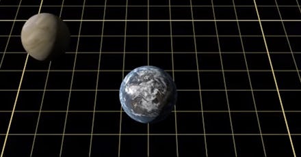
This Interactive Shows the Absurd Scale Of the Solar System

Ever wondered just how big the planet Earth really is? Given our status as specks of dust relative to even major cities, most people have a little bit of trouble visualizing the length of a train or the height of a large building, forget even a relatively small geographic area like a county or state. The above infographic from astronomer Rhys Taylor puts our own limited comprehension of scale into even more bewildering context by comparing the size of the Earth to various other objects in the Solar System. Above is how many smaller objects, like Mercury or the moon, can fit into our lovely planet. Below is how many Earths it would take to achieve the mass of some of the larger bodies roaming our steller neighborhood.
The second-largest planet in our solar system, Saturn, has a mass equivalent to about 95 Earths. The largest, Jupiter, is 11 times the width of Earth and could soak up some 315 duplicates of our live-giving bad boy Terra in total mass. And the Sun could take in 1,000 Jupiters.
There isn't really any context which can relate that kind of scale to tiny humans like us, stuck as we are in our minuscule bodies. Suffice it to say that the solar system is very, very large. If you want to compare how big all of that is in relation to the average person, though, take a gander below:
You need a more recent version of Adobe Flash Player.
For more on the mind-blowing size of the universe, check out this list assembled by PolicyMic's Lucky Tran.