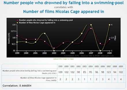
16 Charts Showcase the Most Fundamental Principle of Science You Were Taught in School

Correlation does not equal causation. It's one of the most fundamental principles of statistical research — just because two things appear to be linked doesn't necessarily mean they're related.
But bad science, or faux science, flourishes by making correlation look like causation. The not-scientifically-supported anti-vaccine movement, for example, points to charts claiming to link widespread administration of MMR vaccines to growing autism in the Western world.
But even generously assuming the anti-vaccine crowd's statistical methodology was up to snuff, the fact remains that there's no scientifically demonstrated link between vaccination and autism, nor even a plausible hypothesis to explain such a link. In this case, the increasing rate of autism seems to be related to better detection of the disorder rather than some kind of vaccine-induced epidemic.
Nowhere is this principle better demonstrated than Tyler Ivgen's Spurious Correlations, a website that lets users chart their own poorly thought-out correlations. The results are hilarious as well as disconcerting. The ridiculously well-correlated but clearly unrelated charts show why you should rely only on properly vetted, peer-reviewed science rather than the amateur homebrew pumped out by cranks, alarmists and denialists operating in the face of immense evidence.
Here are 16 of the best ones we could find.