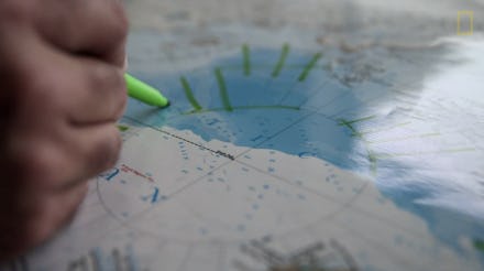
National Geographic Just Announced One of the "Most Striking Changes" They've Ever Recorded

There's a lot of ice in the Arctic — or at least there used to be. It turns out that Arctic ice sheets are melting so quickly and in such large amounts that it's affecting world maps.
Because of how much ice the Arctic has lost, National Geographic is making drastic changes to the 10th edition of their Atlas of the World in what magazine geographer Juan José Valdés is calling "the biggest visible change other than the breakup of the U.S.S.R."
Using NASA's 30-year study of layered ice and information from the National Snow and Ice Data Center, Valdés and cartographer Rosemary Wardley created a new map of the Arctic ice sheet using the most recently available data from 2012, which was actually a historically low ice-level year.
Image Credit: National Geographic
Why the change? Global warming is melting Arctic ice. In every decade since the 1970s, the Arctic ice sheet has been progressively receding by 12%. But this is the first time that the National Geographic has had to remap the region so extensively since it was first comprehensively mapped out in 1989.
The complications mainly stem from a sort of loop: Rising temperatures thin out the Arctic ice sheet. Normally, thick ice prevents sunlight from being absorbed into the oceans and blocks the waters from heating up. But thin ice lets sunlight penetrate through it, heating the water and causing more and more ice to melt. And the cycle repeats.
Snow and ice usually form a protective layer to cool the earth. But without that layer, melting ice causes rising sea levels, harshly impacts wildlife living in the region and affects weather patterns across the globe, according to the Natural Resources Defense Council.
Unfortunately, the new map isn't necessarily perfect or definitive, but that's mostly because the Arctic ice sheet is constantly in flux due to the changing seasons and weather conditions. But National Geographic's map paints an alarming portrait of how global warming is directly affecting the world, according to Valdés, and it should "open people's eyes to what's happening [in] the world."
Scientific proof: This NASA climate visualization is pretty clear evidence that global warming has been, and will continue to be, a real and serious threat.
Image Credit: NASA
These changes threaten the existence of low lying cities in the U.S. and have caused global sea levels to rise an average of eight inches in the last century, reports Mother Jones. Even worse, the 2014 National Climate Assessment report showed that 2012 was the hottest year on record, droughts are more frequent and when rain does fall, it comes in staggering amounts in the U.S.
Just last week, President Obama referred to climate change as a "fairly serious threat to everybody's future." And despite vehement political opposition, in the scientific community there is little debate over whether the Earth is actually experiencing rising temperatures (though there are some disagreements about why and by how much).
Valdés believes that despite frequent reports about the threats of global warming, what we're seeing isn't tangible enough. But he said, "Until you have a hard-copy map in your hand, the message doesn't really hit home." Hopefully the message will finally be received.