One Chart About Income Inequality That Will Make Your Blood Boil

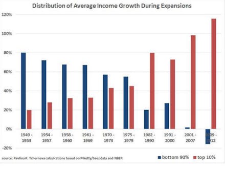
This chart by Pavlina Tcherneva, an economics professor at Bard University, shows a simple yet shocking trend of how bad income inequality has gotten.
The graphic illustrates the distribution of average income growth during every period of economic expansion after World War II:
After a recession, it used to be the case that those in the bottom 90% of income distribution gained the most from economic growth. Following World War II, the wealthiest 10% of American income-earners accounted for only about 20% of income growth. This isn't class warfare — it reflected the fact that those 90% simply outnumber the top 10%, and average income growth mirrored that imbalance.
Since then, income growth has been on a slow but steady decline for most Americans, and a quick incline for the wealthiest. Inequality accelerated in the 1980s, when income growth for the wealthiest 10% shot from just above 40% to 80%. This was the reverse of income distribution immediately following World War II, and it has only gotten worse.
In the period of economic expansion lasting from the end of the recession in 2009 until 2012, average incomes for the bottom 90% of Americans actually shrank, while income growth for the top 10% soared. The data in the chart cuts off at 2012, but, as Matt Yglesias noted, "unless there's a massive break with the previous three expansions we will continue to have an economy where the typical family's living standards grow much more slowly than GDP growth per se would allow."
Tcherneva, the chart's author, said on Twitter that fiscal and tax policies play a big role in the growing income gap, but the dynamic is too complicated to blame solely Reaganomics for the sudden shift in the 1980s. She drew on data from Emmanuel Saez, Thomas Piketty and the National Bureau of Economic Research to formulate the chart.
Another recent set of graphics from the Harvard Business Review showed that while most people understand that income inequality exists, the actual pay gap between CEOs and average employees is far greater than most people think.
The chart above shows how fast that gap has grown across the wider economy, and why reducing income inequality is such an enormous challenge going forward.