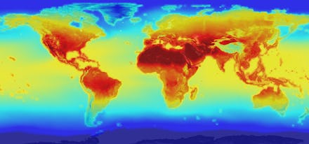
One Graph Reveals How Much Global Temperatures Have Spiked Since 1880

Every single month this year has broken a temperature record, and it's putting 2016 on track to be the hottest year on record since the National Climatic Data Center started keeping track in 1880.
Bloomberg has created an incredible animation that shows how global temperatures have risen above the pre-Industrial Age average. It's similar to the "doom spiral" that climate scientists created in May.
You can see how the spikes in temperature get bigger and bigger over time:
And here's what all the years look like plotted on the graph together:
A spike in temperatures that's less than 2 degrees above average may not seem like a lot, but scientists warn that kind of change can have devastating and permanent consequences. We'll face rising sea levels, droughts, acidic oceans and mass extinctions.
We need real policy change right now if we want to stop that from happening, experts say.
Read more: