The 6 Best Infographics Of 2013

There’s a lot of information on the internet. Too much, almost. Thankfully, some of it gets boiled down and turned into helpful, informative, and often beautiful infographics. And now, the Kantar Information is Beautiful Awards have selected the best infographics of 2013 to help you figure out which are worth your attention. There’s a lot of good stuff here. They didn’t include my personal favorite infographic of the year, but I’ll let it slide. The DailyDot has picked out a few of their favorites among Kantar’s winners, and below are ours. Behold the power – and beauty – of information.
And if you get the urge to make one yourself, head over to Infogram and create your own for free.
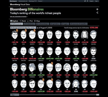
1. Bloomberg Visualizes the World's Richest People
Bloomberg put together this infographic (which won Kantar's Most Beautiful award) of the world's richest 200 individuals. You can sort it by age, gender, industry, and source of wealth. It also shows you how much money they've made (or lost) in the past day or year. Being envious has never looked so good.
2. Today, As a Colorful Strip
Here is Today imagines today as a single block. Set it in context of the month, year, century, millenium, or all the way back to the beginning of the universe. It makes today seem trivial, but oh so pretty.
3. How the Great Recession Was Born
"Global Warning" by Derek Kim gets to the roots of the economic crisis known as the Great Recession. The events and data that preceded the 2008 crash are laid out beautifully in all their horrible glory. Click the link for the full infographic.
4. Unisex Names Throughout History
Flowing Data graphed the most popular unisex names in the United States throughout history, and charted them by gender. Check out the full rundown, and see if your name made the list.
5. The Formula For an Oscar Win
Want the secret to winning an Oscar? Delayed Gratification cracked the code, and figured out which roles have the best odds of taking home the statue. Check out the full graphic, and call your agent.
6. Politicians' Towering Salaries
The team at Visualizing Impact put together this beautiful (and depressing) graphic showing just how much a country's politicians make compared to the relative wealth of their country. The income inequality is shown so beautifully, you almost forget to get really pissed off.